

Art is famously very subjective; “the expression or application of human creative skill and imagination, typically in a visual form such as painting or sculpture, producing works to be appreciated primarily for their beauty or emotional power” So it was with fanzine cover “art”. Yes, I’m calling it art because it is and was creative, innovative, eye catching and thought provoking, very much the application of human creative skill.
On top of that the covers are also a valuable source of news about fans’ views, what was troubling or entertaining them in general at the time and sometimes a peek inside the issue ..let’s take a look.
Colour, shape and form
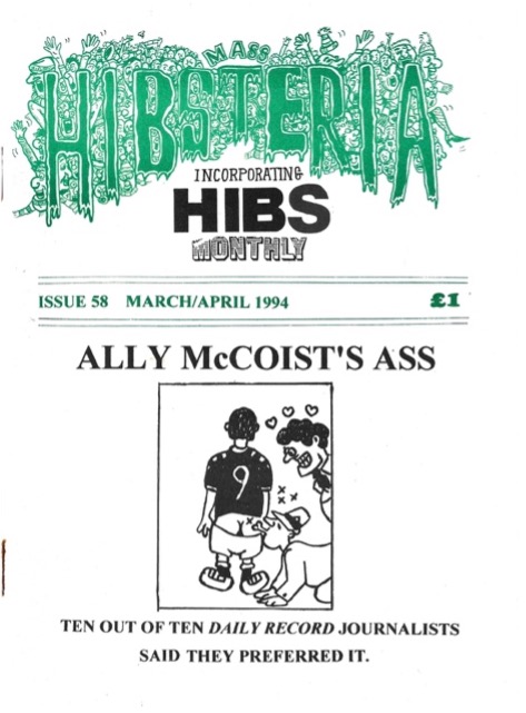
Let’s start with a simple, arresting example which tells a story.. Hibs Mass Hibsteria issue 58 from 1994 covered the Scottish press’ obsession with wee Ally..AND their header is an absolute favourite of mine, the club colours, the mass of fanzine buyers, the joy of support and the fish net stockings…
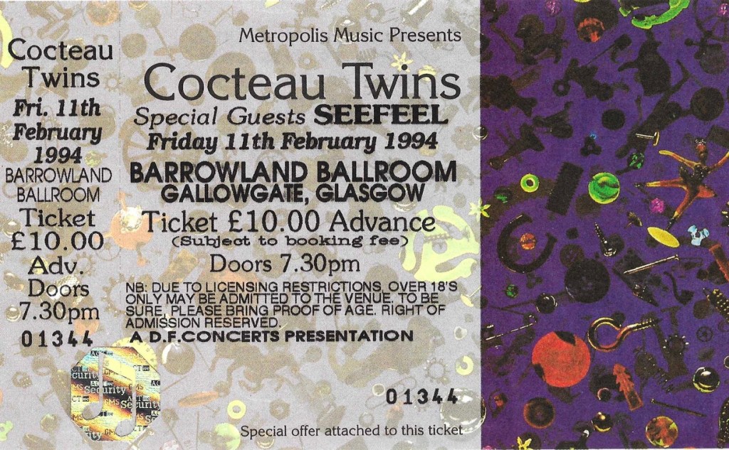
Talking of art when I opened my copy of this fanzine this ticket dropped out. The previous owner had clearly been a music fan of some distinction, not only buying and carefully storing this great fanzine but also attending Barrowland to see the Cocteau Twins in 1994. What a year!. Just look at that ticket though, from a distant time when tickets were art, not a bar code. <Sigh>
Rotherham’s Moulin Rouge issue 9 from October/November 1995 contains so many things that I think make up a great piece of cover art. The hand drawn logos, the reference to music and the joke in both the issue and fanzine name.
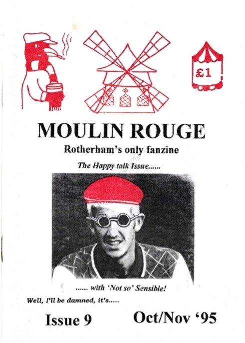
As was the way with fanzines, sometimes the cover art didn’t really correspond to much inside and I’m not sure what the smoking, pint swilling blackbird is a reference to , they clearly just liked the song, a record 11 years old by now. Is Captain Sensible wearing a Rotherham replica? There certainly isn’t much evidence of happy talk inside but why would there be, Rotherham had had a decidedly poor start to the season, the 6 away defeats the fans had suffered before the end of September must be some kind of record!!
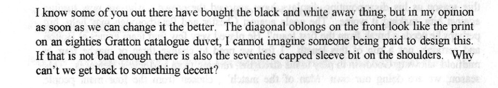
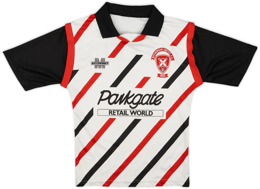
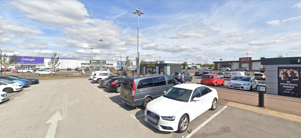
Plus, there is a complaint about the design (design is art, OK?) of the away shirt which looks like a “Gratton (sic) catalogue duvet and to be honest, I can understand why. The sponsor a reminder that local sponsorship is far better than some global corp or betting company. On the other hand it does recall a windswept, rain lashed Saturday morning buying some new keks from River Island and queuing in the car park at Parkgate <shudders>.
Setting The Scene
City Gent is rightly famous, a classic, one of the venerable old gentlemen of the fanzine scene and still producing high quality glossy editions. In issue 250 they have an article listing their 10 greatest covers of all time and they are all indeed brilliant but I don’t think any of them can claim to be better than the cover of the next issue 251, taken by former and original editor John Dewhirst who now runs a great photo fanzine called Bradfordania ( https://www.bradfordiana.net/ ) For any football fan issue 2 recording the strange beauty of Valley Parade is well worth a few quid from your pocket. This photo though, it really is outstanding, a bleak but beautiful shot of the ground and city beyond, breathtaking.

Do I not like that?
Protest was never far away on a cover, West Ham’s Over Land And Sea (OLAS) made their views of the new board of directors appointed by the club in 1994. The Issue 71 cover is very jolly but might also have landed the editors in trouble re copyright!
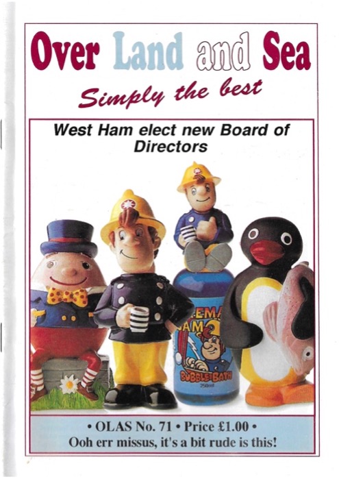
The early 90s were a torrid time at the Boleyn, Terry Brown had taken over the East End working-class football institution and though the Cearns family was still involved, Brown was now chairman and was accused of financial and staff mismanagement. In 2006 Brown sold out to an Icelandic consortium making £33.4m personally from this deal.
Brown was heavily involved with the bond scheme asking fans to raise £15m to rebuild Upton Park and in 1994 Brown had replaced the beloved Billy Bonds as manager with Harry Redknapp..who was reportedly asked to leave after he did an article for a certain West Ham fanzine (Lets see if the current board take up ‘arry’s kind offer to take over for free for the rest of this season..). Anyway, suffice to say in 1994 OLAS didn’t think much of the reshaping of the board.
Moving across London this fantastic depiction of the Chelsea lion appeared on the cover of Chelsea Independent issue 10 in January 1989. It shows that even the club’s badge is against Thatcher’s stupid ID scheme. “Real” art commonly mocks political/royal figures and fanzines were no different in taking this approach.
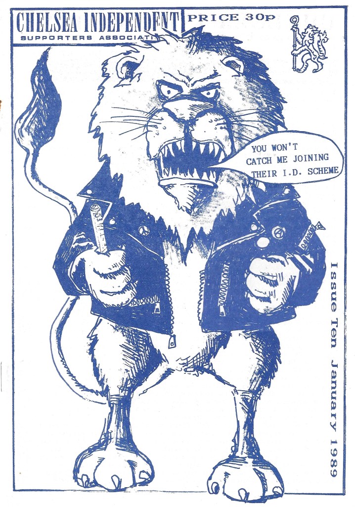
I highly recommend searching out old copies of this fanzine, inside this edition alone there are great pieces on stopping racism and sexism at grounds, a very funny, potentially libelous and almost certainly untrue story about Pet Nevin, more protest about policing and even a letter from chairman Ken Bates himself, highly condescending though it might be.
Balance
LOOK AT THIS PHOTO! Action shots on covers were very commonly used on non-league fanzines covering whole leagues and black and white photography comes into its own here.

Take this classic from issue 21 of Netstretcher in April 1980. The keeper surrounded by forwards but perfectly poised to collect the ball, the full back coming round on the cover and the centre forward just about to clatter the keeper. That’s before we talk about the way your mind (mine at least) immediately starts thinking about mystery of what colours those kits were were..claret and blue, royal blue, red? We’ll never know as there isn’t a credit for the image or what game it was from. I do know that the font and styling used for the numbers on shirts here will never be bettered.
This was the 5th anniversary of Netstretcher being published, starting as a newsletter covering the Merseyside non-league scene alone, now covering all semi pro teams. The cover itself is also a perfect example of providing a teaser as to what was within; Wembley quiz (answers on a postcard, obvs), a “Focus on Barnet” probably unparalleled for years to come. Plus there is the announcement of the England squad, not the Clemence, Coppell, Neal, Sansom, Keegan variety, the Semi Pro England squad including Malcolm Shotton. I remember trundling round for the likes of Huddersfield, Oxford, Barnsley and Hull amongst others and I’m sure others on this list went on to cross the white line at the likes of Hartlepool, Torquay and Doncaster.
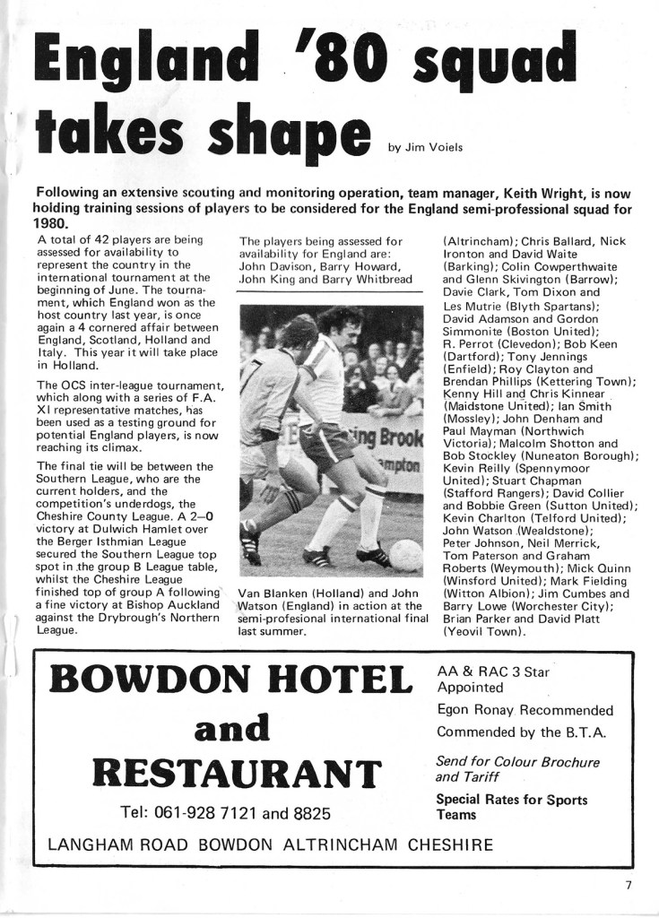
I’ve left the ad for the Bowdon Hotel in as adverts are another classic “artwork” of the time; THREE AA/RAC stars, Egon Ronay has recommended it, commended by the B.T.A! Plus, special rates for sports teams. I did find a reference to the Bowdon on a website when researching this blog. It says, “Due to unprecedented circumstances the hotel has closed for the foreseeable future” Even Egon couldn’t save it.
Art Attack!
Finally, let’s go back to Scotland and the early days of fanzines. In March 1981 Cheers, the Meadowbank Thistle fanzine was already on issue 20 when others weren’t even a twinkle in the eye of teenage fanzine producers to be.

This 17p edition (WHY 17p?!) for the game against Montrose (it often served as both match programme and fanzine) carried fantastic cover art drawn by the driving force of much of the fanzine activity at the thistle, Alick Milne. Alick is now in the Hall of fame for his work as a director and programme editor at Edinburgh city, still at the Meadowbank stadium.
The cartoon sarcastically imagines the Meadowbank stadium becoming the home of the national side with fag ash, mank, stour, glaur and essence of flatulence all being added. Ahhh, the 80s, if anyone tells me again that this was the greatest decade….
Hampden began redevelopment in 1981after a riot at the 1980 Scottish cup final led to reforms and the banning of alcohol from Scottish grounds. The work included such luxuries as concreting all of the terraces…for £3m the SFA managed to reduce the capacity of Hampden significantly to 74,370.[1]
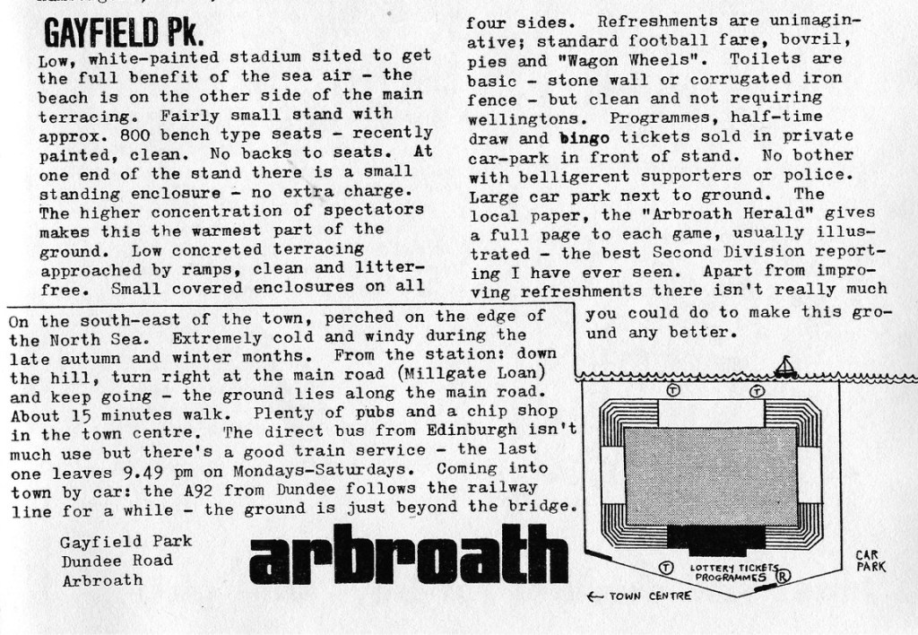
OK I know this blog is about cover art but I can’t help reproducing some more work by Alick inside the zine. His reviews of Scottish grounds are sensational and this one of Arbroath’s Gayfield Park, the ground closest to the sea in the UK contains a beautiful illustration plus the immortal line “The higher concentration of spectators makes this the warmest part of the ground”
The Final Whistler’s Daughter
I mean what can I say, art IS subjective. So, although I love these covers and what they reveal about society, football clubs, fan thoughts, fandom, protest and passion in fanzines you might not see the same as me.
What I see is incredible creativity, satire, brilliance and beauty. With 1795 fanzines now on the list and therefore hundreds of thousands of covers produced in that time this is a subject that deserves study and admiring again and again and again.
[1] Inglis, Simon (1996). Football Grounds of Britain.

Leave a comment